REPRESENTATION
Humble beginnings with the noblest intentions
Established on November 4, 1861 as Escuela de Artes y Oficios with the primary intention of helping out the young lads of Bacolor; the school was then built on a donated lot. This marks the modest beginnings of Don Honorio Ventura State University.
From the hearts of those who initiated its birth reigns the values of benevolence, courage and faith. The same values inculcated to the many “Honorians” whose minds and hearts were shaped towards Excellence, Professionalism, and Good Governance.
The Transformation
For the past 158 years, DHVSU underwent significant changes not just in the name but more so its growth as a reputable academic institution. The passion of the DHVSU community fueled its expansion from an Arts and Trade School to a Technological State University. To further extend the institutions services to a greater populace in providing curricular offerings attuned to societal needs, Republic Act 11169 was enacted by the Senate and House of Representatives on January 3, 2019. This is an act renaming DON HONORIO VENTURA TECHNOLOGICAL STATE UNIVERSITY to DON HONORIO VENTURA STATE UNIVERSITY.
Insignia
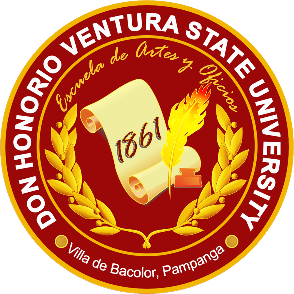
The need for a new Logo as an adherence to the change in the name of the institution is part of the transformation process. The following elements comprise the new Logo Identity of the University:
The Scroll signifies the learning and inner wisdom of the entire DHVSU Community brought about by their unwavering commitment to uphold its mission and vision.
Igniting the Honorian spirit to continually strive amidst the different challenges and adversity that may come their way is represented by the Burning Plume and Ink. This also implies the perseverance embedded in every Honorian’s heart; the drive to uplift their individuality and influence the resilience of others.
The Golden Laurel Leaves symbolize excellence, awards, and achievements attained by all sectors within the DHVSU Community. Its Fruits represent the colleges and extension campuses as its main promulgator of accessible and responsive education. This above all reinforces the purpose of the institution in catering to the needs of all who wish to acquire learning and to see to it that no one is left behind.
Presented in a Three-Ring Dimension, the Logo’s spherical shape denotes stability and incessant quest for brilliance. As a Higher Educational Institution, it is the mandate of the University to guarantee the Holistic molding of all students in areas necessary for their existence. The Innermost Ring represents the students, the main beneficiaries of the quality education offered by the Institution. The Center-solid Ring which holds the name of the institution also encompass the two major sectors of the University – Teaching and Non-teaching – as represented by the smaller circles adjacent to one another. The mentioned sectors also serve as the bond that links the students and other stakeholders; the latter, represented in the Outermost Ring.
Being the oldest vocational school in the Far East and an Institution which surpassed both Man-made disasters and Nature’s wrath, Bloody Maroon is depicted as the prominent color variant. This signifies the courage and boldness of every administrator, faculty, student and personnel whose blazing spirit never stopped burning. Living up to the Nobility of its name, the variant Golden Yellow represents Prominence and the Value of Benevolence all for God, for Honor, and for Man.
The Work Force
The collaborative efforts of the technical working group: Mr. Rogelio L. Pacatcatin, Jr., the graphic artist responsible for the design of the logo; Mrs. Joyce Ann M. Tolentino and Mrs. Antonia B. Fernandez, in charge of the written account for the Logo identity’s significant elements/components; and Engr. Reden M. Hernandez, the Vice President for Academic Affairs, in charge of the overall supervision of the task and the head of the TWG; resulted to the creation of the new Logo.
Equally significant is the guidance provided by Engr. Rohel S. Serrano, Executive Vice President; Dr. Reynaldo C. Nicdao, Vice President for Administration and Finance; Dr. Dolores T. Quiambao, Vice President for Student Affairs and Services; Engr. Ranie B. Canlas, Vice President for Research, Extension and Training Services; and Dr. Enrique G. Baking, University President. Their input and suggestions on the overall presentation of the new University Logo brought about further refinement on the aesthetics and exemplifications of its components.


